One text for comparison of materials
There are eight physical techniques in the collection of unusual typography . Here we’ll take two: letters made of thick industrial rubber and letters made of glazed ceramic. Use the same short phrase so that the differences come from the material rather than from a different word or composition.
Replace TEXT with the inscription. Start with two or three words that can be broken down into large lines. In both queries there is a rule to adapt the size and hyphenation to the length of the phrase. After generation, check each character anyway: requiring exact text describes the desired result, but does not replace verification.
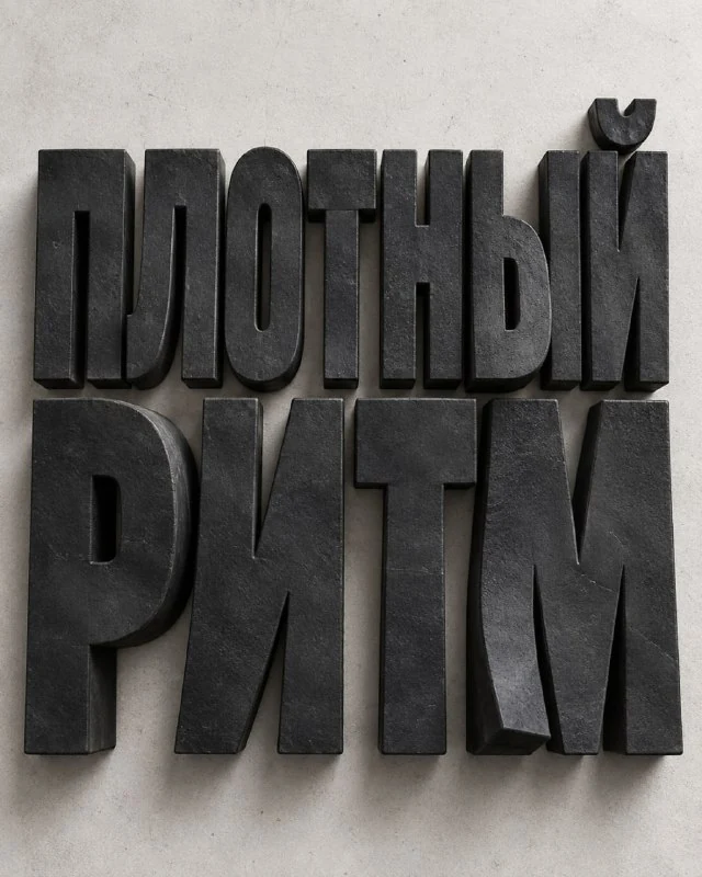
Thick industrial rubber
Heavy industrial rubber letters
Create a striking experimental typographic poster in a vertical 4:5 format. Main text: «TEXT» Reproduce the supplied text exactly as written, character for character. Never translate, transliterate, rewrite, shorten, correct, replace or omit any part of it. Make the text extremely large and dominant. Automatically adapt font size, number of lines, line breaks and spacing to the actual text length. Longer phrases should become a bold 2–6 line composition while keeping every word clearly readable. Treat the typography as a real three-dimensional object cut from very thick industrial rubber. The letters should have strong mass, slightly softened edges, subtle surface grain, realistic matte texture and a heavy tactile presence. Some parts may bend or lift very slightly from the surface, creating tension and dimensionality, but the text must remain bold, sharp and fully legible. Minimal neutral background, strong controlled studio lighting, subtle shadows, restrained microtypography and tiny technical details. Contemporary experimental graphic design, tactile typography, premium editorial poster, photorealistic material interaction. No people, no portraits, no extra decorative objects.The important ones are very thick industrial rubber, realistic matte texture and strong mass. This is a dense, heavy material, not a balloon. Letters should have visible thickness, softly finished edges and a calm surface without a mirror-like chrome sheen.
Slight bends and raised parts add tension. But if the letter folds in half or spreads, the material begins to look liquid. Refine slight deformation and preservation of basic strokes. Separately, check that the internal holes in the rounded letters are not closed.
For the first option, keep the background neutral and one rubber color. This makes it easier to estimate the volume. If you immediately add acidic colors, complex environments and lots of highlights, it becomes difficult to understand what exactly made the result look like plastic instead of rubber.
Glazed ceramics
Letters made of glazed ceramics
Create a striking experimental typographic poster in a vertical 4:5 format. Main text: «TEXT» Reproduce the supplied text exactly as written, character for character. Never translate, transliterate, rewrite, shorten, correct, replace or omit any part of it. Make the text extremely large and dominant. Automatically adapt font size, number of lines, line breaks and spacing to the actual text length. Longer phrases should become a bold 2–6 line composition while keeping every word clearly readable. Treat the typography as a real three-dimensional physical object made of glazed ceramic. The letters should feel heavy, sculptural and handcrafted, with subtle imperfections from firing, slightly uneven glaze behavior, realistic ceramic texture, matte and glossy areas, tiny cracks or glaze pooling, and convincing thickness. The spelling must stay perfectly readable. Minimal neutral background, refined studio lighting, realistic shadows, subtle microtypography and restrained technical details. Contemporary experimental graphic design, tactile typography, premium editorial poster, photorealistic material rendering. No people, no portraits, no extra decorative objects.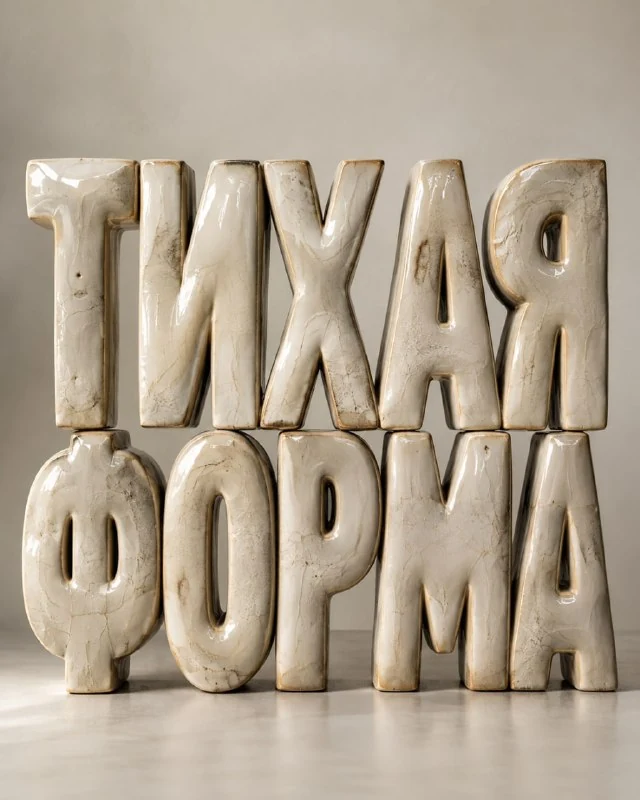
The second query describes the surface in terms of glazed ceramic, uneven glaze, small firing marks and a combination of matte and shiny areas. They must remain secondary to the form of the word. Large cracks will turn the ceramic into eroded stone and reduce legibility.
Look at the ends and rounding points. The glaze can gather a little more densely in the recesses, and the highlight can gently pass along the convex part. If the letters look like perfect glossy plastic, refine the ceramic surface and slight hand unevenness while maintaining the overall geometry.
Light shows the difference
Matte rubber can be read by the wide soft transitions of light and shadow. Ceramics allow more noticeable local reflections. Don't use one overly sharp highlight as the only evidence of volume: thickness, contact shadow and the position of the letters relative to the surface are also important.
Compare options on the same scale. Make sure that the shadows do not turn several words into one dark mass. Spaces are needed between lines, even if the inscription must be very large. For a long phrase, it's easier to add a line than to condense each letter.
Final poster
The originals allow for micro-typography and technical details. If they are not needed, remove these descriptions so that the model does not come up with random captions. Put the date, author and explanation manually in the editor, next to the large material inscription.
Check the word in a small preview, then save the clean version and the decorated layout. For another way of working with material form, see text inside transparent capsules: there the surface surrounds the letters rather than replacing them.
Select the inscription for the next layout
For other inscriptions and materials there is Creative AI Typography: 823 prompts with examples, search and sections. In the free demo you can test the approach on your own text.