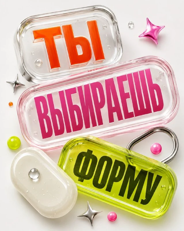
Break down the phrase into meaningful parts
The first request from the collection of experimental typography suggests distributing the text into large transparent capsules. Take a phrase of two or three words and first determine its order. For example, each word can occupy a separate object, and reading can be done from top to bottom.
Replace TEXT with your entire phrase. Do not insert it again into additional instructions, otherwise unnecessary options for the inscription will appear. The original specifically stipulated that each source element of the text should appear only once. After generation, count the words and compare the spelling with the source.
Original prompt from comments
The phrase in transparent volumetric capsules
Create a visually striking experimental typographic poster in a vertical 4:5 format. Main text: «TEXT» Preserve the supplied text exactly as written. Never translate, transliterate, rewrite, shorten, correct, replace or omit any character. IMPORTANT: the supplied phrase must appear exactly once in the entire poster. Never repeat the full phrase, individual words or text fragments elsewhere. When the phrase is split between capsules, each original word must appear in one capsule only. Break the phrase into several large typographic blocks and place those blocks inside oversized transparent capsule-like objects. The capsules should feel like a hybrid of premium UI forms, translucent jelly, blister packaging and optical acrylic. Use rounded corners, thick transparent walls, subtle bubbles, soft refraction, glossy highlights and dimensional shadows. Give selected capsules different but coordinated material treatments: clear glass with colored typography, milky resin, acid-green jelly, soft pink acrylic or a thin metallic rim. Arrange them at different angles and depths so they overlap spatially without obscuring the text. Keep every capsule and every letter fully inside the 4:5 canvas. Nothing may be cropped. Maintain a controlled safe margin and reduce the scale for longer phrases. Use a pale grey or clean white background with vivid controlled accents. Add a few small non-text graphic elements such as glossy stars, dots or rounded markers. Contemporary graphic design, tactile 3D typography, glossy material realism and playful luxury art direction. No people, no duplicated text, no secondary copies of the headline, no hands, no mockup, no watermark.The capsules are described as a mixture of clear packaging, optical acrylic, jelly and large interface shapes. This is a visual analogy, not an instruction to create a working interface. Physical objects with thick walls, rounded corners, highlights and shadows remain in the frame.
For the first option, keep the background light and a few coordinated colors. If you add a complex environment, another big title and a lot of objects, the capsules lose their independence. All the text is already inside them; a second repetition of the phrase outside is not necessary.
Different materials in one system
The request lists clear glass, milk resin, green jelly, pink acrylic and metal edge. You don't have to show everything at once. For two words, you can limit yourself to a transparent and milky capsule, maintaining the general roundings and direction of lighting.
Glass should transmit the background and give local reflections, milk resin should look denser, and jelly should react more softly to light. If all objects differ only in color, clarify the difference in transparency and surface. First achieve the material, then add new shapes.
Intersections without loss of reading
Different depths and angles make the composition come alive. But the foreground capsule should not cover the letter in the adjacent one. Check not only the central part of the words, but also the outer characters: a transparent wall can also distort them beyond recognition.
The arrangement should give a clear sequence. If the viewer starts with the third word because of its size and color, reassemble the hierarchy. You can bring the dimensions closer, tone down the brightest material, or increase the distance between objects. Don't try to correct the reading order with even more arrows.
Fields and additional details
The original requires keeping all the capsules and letters inside the vertical format 4:5. For a long phrase, reduce the overall scale and add meaningful lines. After generation, check the margins: the short tail of a letter or the edge of a transparent object is easily cut off.
Stars, dots, and bullets are allowed as small non-text accents. Leave only those that support the direction of your gaze. Add the date, signature and real logo manually. If you want a more formal material without a clear shell, compare this approach to the rubber and ceramic letters .
Select the inscription for the next layout
For other inscriptions and materials there is Creative AI Typography: 823 prompts with examples, search and sections. In the free demo you can test the approach on your own text.