Choose a short word with different outlines
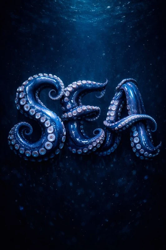
In of the original publication the text is constructed from octopus tentacles. For the first experience, take four or five letters: for example, a short project name. The longer the phrase, the more places where the bends can get mixed up or cover an adjacent character.
Before generating, write the word in regular font and look at the holes inside the letters. They should remain open after transforming into an organic form. «О», «Р» and «В» have different interior spaces; suckers and intersections should not make them look the same.
Original prompt
Tentacle inscription
the text "Your Text", fluid organic typography, letters formed and wrapped by octopus tentacles, suckers clearly visible, tentacles shaping curves and strokes of the letters, wet glossy surface, deep sea lighting, dark blue background, ultra detailed, centered, 4k 3:4Replace Your Text with your word. The phrases letters formed and wrapped by octopus tentacles and tentacles shaping curves and strokes require tentacles to be involved in the construction of the strokes. If you end up with ordinary metal letters with a separate octopus on top, the main idea is not fulfilled.
The original sets the vertical format 3:4, the central composition and deep water light. This is convenient for a self-made poster. If the text is needed in a horizontal banner, specify the format in advance and leave margins around the word instead of cutting off long tails after generation.
Suction cups should explain the material
The words suckers clearly visible give a characteristic surface. The suckers should go along the tentacles and follow their turns. Random round holes throughout the letter look like a different material and make it difficult to perceive the shape.
Assess the scale of the details. Large suckers can turn a short inscription into several unrecognizable lumps. Very small ones will disappear in the preview. It is useful to make two versions with different tentacle thicknesses, keeping the word, angle and background, and then compare them at the same size.
How to maintain readability without losing effect
Bends work better at outer ends and connections than in the middle of each character. If the letters are confusing, ask for clearer main strokes and less overlap. Don't add more tentacles, more highlights, or a more complex background at the same time: these changes will increase the noise.
Check the result in black and white. If the word is recognized only thanks to colored highlights, the geometry is not yet clear enough. You can keep the wet glitter and blue light for the final poster, but the outlines should work without them.
Lighting and layout assembly
A wet surface can be read by glare and soft reflections. The dark blue background should be different from the shadow parts of the letters. If everything is blurred, add clearer backlighting or lighten the background a little without replacing the material itself with plastic.
In the editor, leave the inscription as the main object, and put the explanation in a calm font. Don't repeat organic swirls in every decorative element. Save the version without additional inscriptions: it will be useful for the cover, card and series of posters. Another natural texture can be studied using the example of stone letters with moss .
Select the inscription for the next layout
For other inscriptions and materials there is Creative AI Typography: 823 prompts with examples, search and sections. In the free demo you can test the approach on your own text.