First the product, then the effect of the letters
Typography for cosmetics should help understand the advertising message. Beautiful material is no substitute for a clear headline and packaging photo. If we sell shower gel, you can highlight the name of the collection or a short phrase. It is better to type the composition, volume and terms of purchase in exact text in the editor.
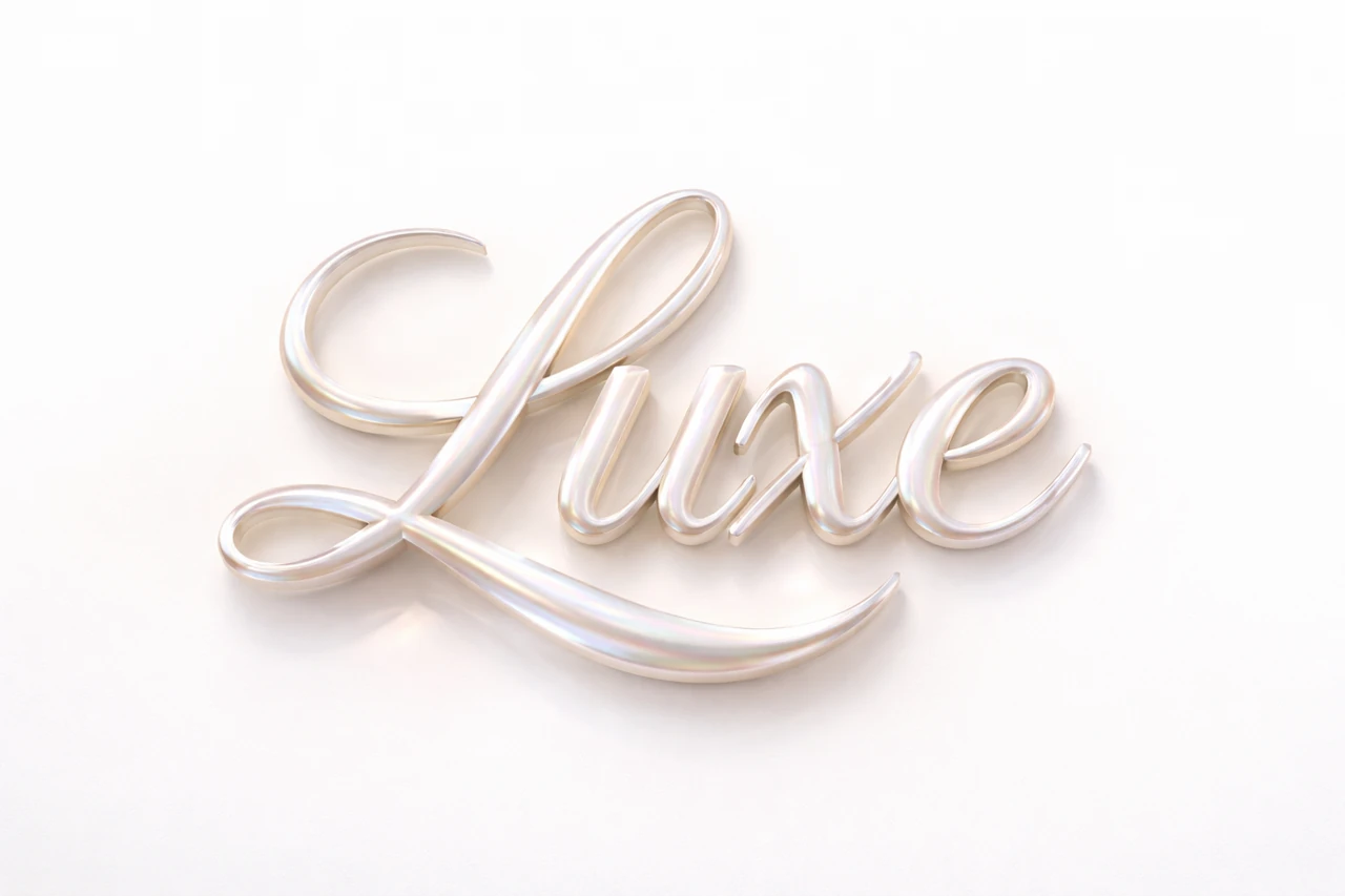
Let's take a banner with a bottle and the heading «МЯГКОСТЬ». The packaging is light and has a pink accent on the label. For this layout, let's try mother-of-pearl letters on a calm background. For another version, we use a soapy surface, but keep the same composition. This way we will compare the material, and not two completely different designs.
Before generating, prepare a real photo of the product. Don't ask the neural network to draw an accurate label and a complex title at the same time. The generated inscription can be combined with the original photo, preserving the recognizable packaging and the correct inscriptions on it.
Pearl header
Mother-of-pearl inscription for beauty visuals
pearl luxe typography
"ВАШ ТЕКСТ",
pearlescent finish,
subtle iridescence,
luxury skincare aesthetic,
high-end beauty vibe,
hyperrealistic 3D,
soft studio lighting,
text only, isolated typography,
subtle shadow on white surface,
ultra detailed, 8k
Replace «ВАШ ТЕКСТ» with the correct word. Pearlescent finish defines the surface, and subtle iridescence defines soft tints. These details are useful when the headline needs to look dimensional, but not too contrasting. A white background and soft light help you see the shape of the letters.
If the result almost blends into the background, try a different background in the layout or a slightly darker shade of the letters first. Increasing the shine is not always useful: it can lighten the surface even more. It is important that the text is readable without having to look at the overflows for a long time.
Soap inscription
Volumetric letters made of soap
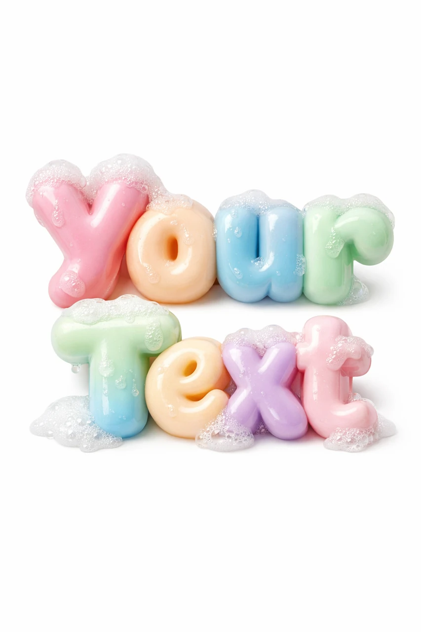
Soap typography "Your Text", smooth handmade soap letters, milky pastel colors, clean spa aesthetic, soft foam details, hyperrealistic 3D, macro surface texture, soft studio lighting, isolated typography. 3:4Here, instead of «Your Text», you can put the same «МЯГКОСТЬ». The prompt describes the smooth soap, milky pastel colors and small foam details. If the foam has covered the letters, reduce the amount of foam in the description. Get a readable word first, then add decorative elements.
The soap effect is not suitable for every product. For advertising perfume or decorative cosmetics, it can create the wrong association. Choose material based on the task: what the buyer needs to understand about the product in a few seconds. Avoid effects that promise properties that are not included in the actual product description.
Assembling a beauty banner
- Post a photo of the packaging and leave space for the title. Decide which element will be the main one.
- Cut out the generated inscription and place it on a separate layer.
- Compare the direction of light on the letters and the product. Too different shadows can create the feeling of a random collage.
- Add a short explanation in regular font. If the heading is decorative, the explanation should be easy to read.
- Check the contrast and text size on your phone. Then save your working file and export the desired format.
Do not try to repeat every detail of the neural network texture in other elements. It is enough to maintain one color and softness of lighting. If the background, title, and button are all shimmery, the viewer won't have a clear spot to read from.
Check before advertising
First, re-read all the words: the decorative surface can hide unnecessary touches. Then check the packaging, logo and numbers. The layout should use an actual photograph of the product, not a similar made-up bottle. Pay attention to the edges of the mask: the light halo is especially noticeable on the colored background.
For a series of banners, fix the position of the product, the size of the title and the style of the explanations. Change only the name and material where it helps differentiate the products. If you want a more transparent surface, compare these options with glass typography .
Select the inscription for the next layout
For a series of advertising layouts, it is convenient to select inscriptions from one library. In Creative TyPography there are 823 prompts with examples of materials and effects. You can start with a free demo.