How to choose a glass effect for an inscription
Before creating glass text in a neural network, determine the background of the future layout. Transparent material is visible due to reflections, edges and refraction. If the background and letters are equally light, the word may get lost. Therefore, the glass header should be evaluated together with the backing, and not just on a separate preview.
Matte letters give a soft texture and fewer small reflections. You can try them on a cover, in a presentation, or in an ad with plenty of white space. Faceted iridescent glass is more active: it is suitable for one large word, next to which there is a short explanation in regular font.
Start with a short caption. On several letters it is easier to see whether the generator has correctly conveyed the material and has not mixed up the characters. For a two-word title, test each one individually first, then try the overall composition.
Prompt for frosted glass text
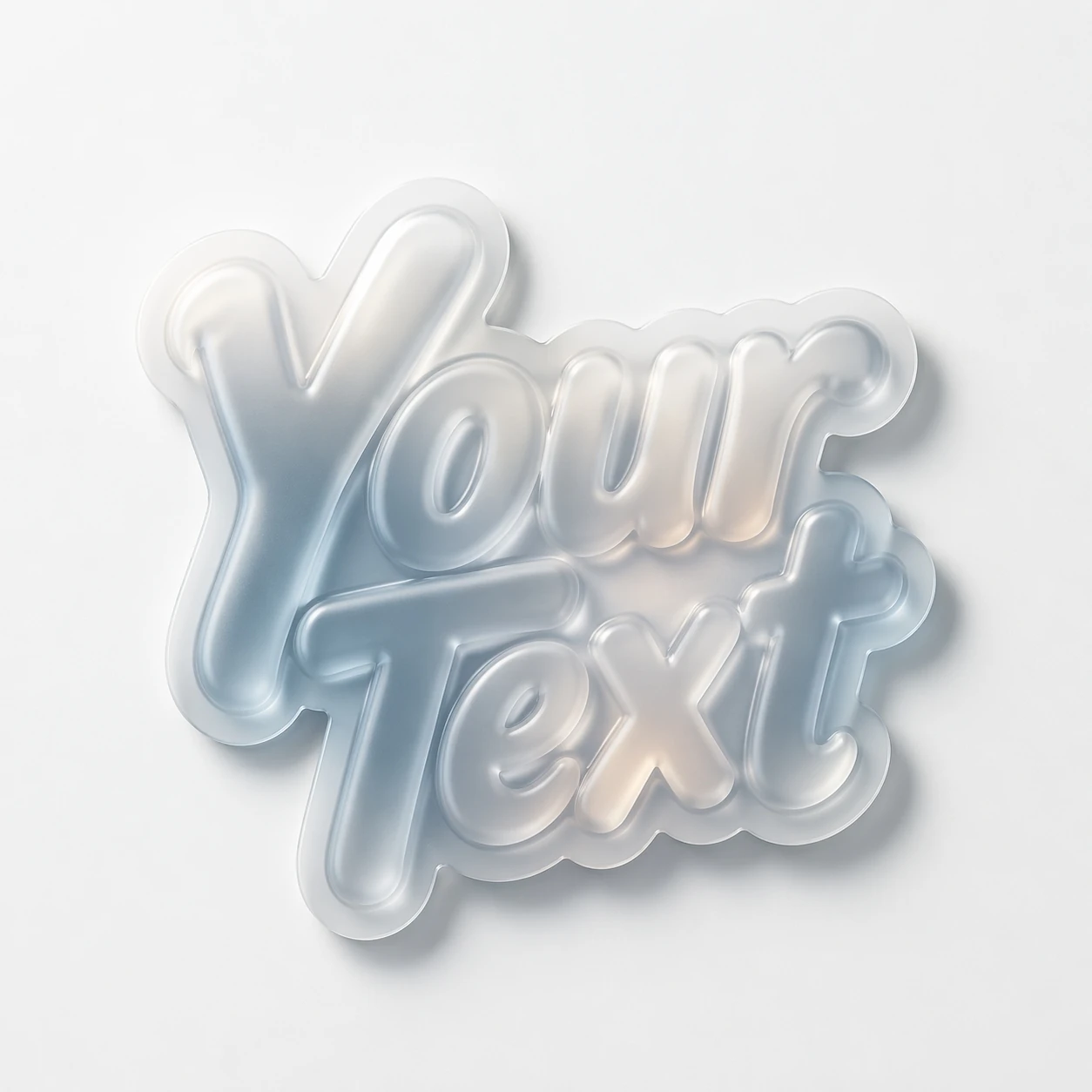
This example builds letters as a three-dimensional glass object. Soft light helps keep the surface visible without too harsh a shine.
Frosted glass lettering
frosted glass typography "YOUR TEXT", glassmorphism style, semi-transparent letters with soft blur, die-cut sticker edges, glossy laminate, subtle inner glow, clean white surface, soft shadow, premium product photography, ultra detailed, 8kReplace YOUR TEXT with the desired inscription, keeping the quotes. Don't immediately change the material, color and lighting: get the basic version first. You can then refine the glass shade or background by comparing each result with the original.
If you want a more defined silhouette, ask for prominent edges and separation from the background. Don't add a lot of strong highlights at once: they can turn a calm matte surface into polished plastic. The wording of the prompt describes the desired image, so the final material still needs to be assessed visually.
Prompt for iridescent glass letters
In the second option, edges and color refractions are important. This is a more decorative effect that works better large.
Iridescent glass with edges
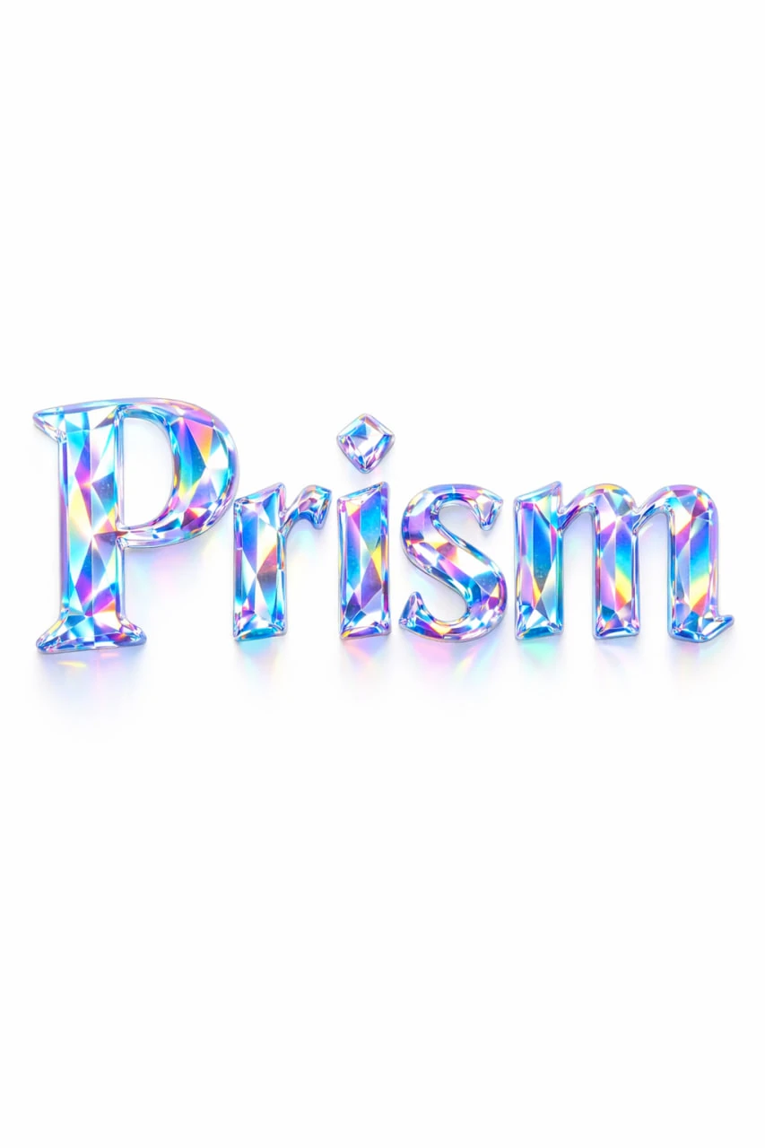
Holographic luxury typography spelling the text "YOUR TEXT", letters formed from iridescent diamond glass, rainbow light dispersion, hologram reflections, futuristic fashion aesthetic, macro lens, photorealistic 8K, isolated on pure white background, no shadows, vertical aspect ratio 3:4Words about cutting define the geometry of the surface, and words about holographic tints define the color of reflections. If you want a quieter look, reduce the amount of colored highlights and ask for mostly clear glass. For a bright composition, you can leave the original version, but keep the background simple.
The smaller the inscription in the finished banner, the less it costs to add details. On a small screen, edges merge and thin sections of letters disappear. Check the result at the scale at which the viewer will see it.
Transparent material and transparent background are two different things
Glass letters can be depicted on an opaque white or colored backing. Such a file does not become a PNG with transparency just because of the word glass in the request. To place it in the editor, you will have to remove the background or use the image along with its original scene.
It's easy to lose light edges when cutting glass. Don't remove all the nearly white pixels in one motion; they may be related to the object itself. Test the mask on light and dark substrates. Sometimes it's faster to find a similar layout background than to try to perfectly separate translucent letters.
How to assemble a composition in a graphics editor
- Place glass lettering as the main visual element.
- Leave a quiet space for additional text.
- Type the description, date and price in regular font.
- Check the contrast of the letters and background in the final size.
- Compare the option without additional shadow and with one soft shadow.
Don't try to replicate the iridescent effect in every detail of the layout. One complex title already creates emphasis. It is easier to choose a simple font and a limited palette, taking one shade from glass reflections.
If the result is more metal than glass, remove words about chrome and metallic shine from the query. For an informed comparison of materials, there is a separate article about chromed text. And in analysis of 3D text shows how to assemble a banner around the generated inscription.
Select the inscription for the next layout
You can try these effects for free in the demo. The complete Creative Typography contains 823 prompts with examples to choose material for a specific layout.