Start with service names
Take three specific services and label the results of each. For example: subject photography, social media design and advertising design. The wording must differ in meaning. If the captions are almost the same, no icons will explain the difference. First, clarify the content of the cards, then choose images.
For each service, make a list of two or three clear subject associations. For filming it could be a camera, for advertising it could be an object related to its task. You don't have to find the literal icon for every professional term. Sometimes a simple caption without an image gives a clearer result.
Choose assets with a consistent visual treatment
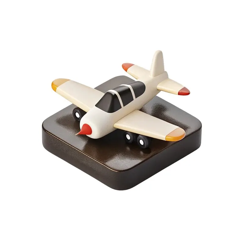
For the exercise, open , a set of 48 PNG icons , published by in CreoPrompt. Look not only at the subject, but also at the angle, light, saturation and thickness of the form. Mixing a flat icon and a realistic three-dimensional object can look random.
If a set does not have three suitable items, do not change the meaning for the sake of a complete set. Choose another common method: photographs, simple geometric signs, or cards without icons. A consistent system is more useful than three separate flashy images with different logic.
Match the visible size of the objects
Place the icons on areas of the same size. Then compare the visible shape itself: an elongated object may appear smaller than a round one with the same file width. Adjust the scale with your eyes and the general support. Don't stretch the image disproportionately to fill the frame.
- Select a separate area of the image above or next to the title.
- Place items with equal margin to the text.
- Compare the visual mass of three objects on one sheet.
- Check to see if one shadow is different in direction and strength.
- Look at the cards in a smaller size: small details should still be clear.
PNG can contain transparent fields and its own shadow. Take them into account when leveling. Don't automatically add another identical shadow to all objects: it may conflict with the existing light. Start with a simple solid background and enjoy the set without any additional effects.
Give the captions the same structure
Include the name of the service and a short explanation of the result. If one card has a long paragraph and the other two have three words each, the block will become uneven. Shorten the wording or provide more space. Don't make the font smaller on just one card; this creates a random hierarchy.
If there is an action on the cards, name it according to its purpose: find out details or discuss the task. In a static picture, the block only indicates an action, and the real link is in the publication or on the website. The text and icon should lead to the same meaning.
Check out the set without explanation
Show the cards to a person who did not create them. Ask to name the services and differences. If the answer is based only on headings, this is normal: icons can support text. But if the item is misleading, replace it or remove it.
The finished system can be included in social network templates. For a more complex composition, check out the banner assembly from PNG, and additional open sets in the free materials section .
Assets for your next layouts
When a free set is not enough, look at the categories of the 2026 Designer Pack. It is important to choose materials with a general flow, and not fill each card with any available object.