Describe the features that must stay unchanged
For the tutorial character, choose a head shape, primary colors, eyes, proportions and one recognizable accessory. Write it down in a short list. It will help distinguish the desired mascot from a similar new hero. Don't add a dozen small details that will disappear in a small preview.
First, prepare a neutral reference: a portrait or entire character against a plain background. It is needed for comparison, and not necessarily for publication. Approve its appearance before working on scenes. If the brand already has a mascot, use agreed-upon references and design guidelines instead of creating a different image.
Create a Character Base
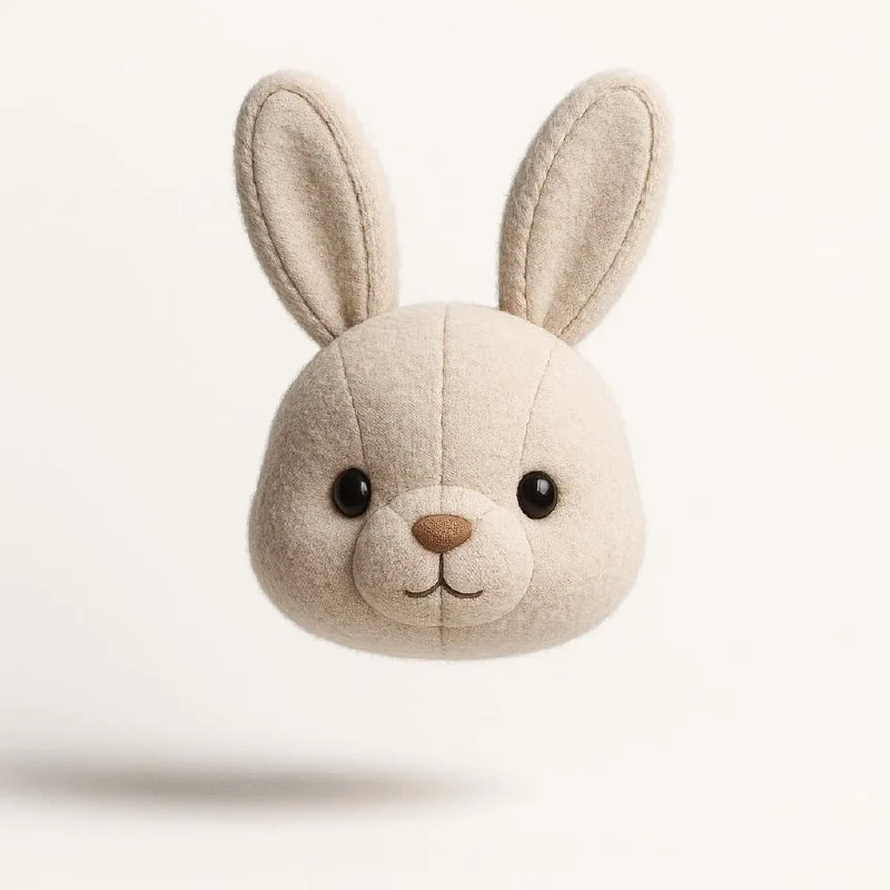
The initial prompt creates a portrait - the head of a plush character. Substitute the description of your character for the original object. For scenes with hands and props, replace the requirement for a portrait with a full-length description of the character and set the desired action. The original request itself below is preserved without changes.
Plush Character: Portrait
Create a stylish 1:1 minimalist poster featuring a highly detailed 3D render of an adorable plush [animal] head floating mid-air against a clean white background. Emphasize ultra-realistic textures-visible stitching, fabric seams, and soft fur-with soft studio lighting that enhances its cute, huggable charm. The composition should be sleek, modern, and heartwarming, balancing hyper-detailed craftsmanship with irresistible 'kawaii appeal. Use subtle shadows for depth, ensuring a premium, high-quality aesthetic.Save the selected image and request text. When the tool supports reference, use the reference for the following scenes. If only text generation is available, compare the options especially carefully. One identical paragraph in a request does not guarantee the preservation of the face and proportions.
Set three clear actions
For the first series, take simple plots: the mascot greets, shows an object and holds a blank card for the announcement. Don't ask for complex movement, an unusual angle, and a lot of props at the same time. The more the scene changes, the harder it is to notice where the character himself has changed.
- In the greeting scene, keep the mascot's face unobstructed and avoid details that cover its eyes.
- In the tip scene, use one object directly related to the topic of the post.
- In the announcement, leave a free area for the text that you will add in the editor.
- In each scene, check the color, accessory and basic proportions against the standard.
First compare the characters on one sheet without titles or backgrounds. If they look like different characters, fix the basis of the scene. Matching the overall layout color does not compensate for a different face. Also check the hands, how objects are supported, and the absence of extra details.
Collect publications in the editor
Use common margins and plain text positioning. The mascot itself may change pose, but the title block should remain predictable. For an announcement card, type the information over the blank area. Don't count on accurate small text created within the image.
Don't hide important information with your character. If the mascot takes up too much space, make it smaller or change the crop. It helps explain the message, but should not supplant the date, instruction, or action. Compare the layouts in small size side by side.
Save the rules to continue the series
In the project folder, keep the standard, a description of the permanent features, three approved scenes and a publication template. For a new scene, first describe the action, then check the character against the list. This order will reduce the number of random changes between posts.
For the basic shape there is comparison of plush and knitted mascot . If you need to embed scenes into regular posts, use social media post templates. Add a decorative headline after the main message has already been read.
Select the inscription for the next layout
The decorative inscription next to the mascot can be selected in Creative Typography. It complements the character; important explanations and instructions are best left in plain text.