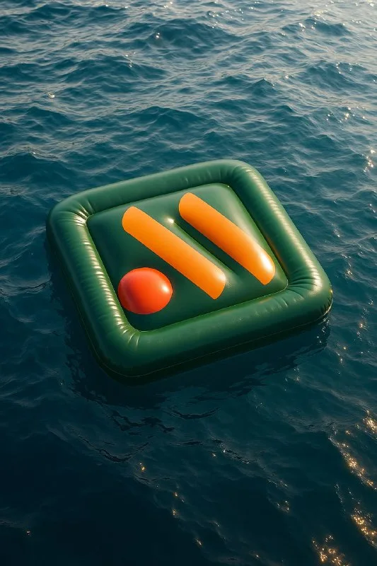
Choose a mark recognizable by its outline
The original collection includes four water scenes. They share one idea: the logo keeps its silhouette and colors while looking like an inflatable rubber mattress. Choose a simple mark with two or three large parts for the exercise. Thin lines and small lettering make the conversion to volume harder.
Prepare a logo image without unnecessary surroundings. If your generator accepts an image reference, upload the mark itself rather than a screenshot containing menus and advertising. Replace [Brand] with the brand name in the text prompt. The name provides context; the visual reference provides the shape of that particular version of the mark.
Check enclosed openings and gaps carefully. In letters and composite symbols, the material can fill them in. Before generating, identify which spaces are essential to recognition, then compare the result with the original.
A version on open water
An inflatable logo on open water
Ultra-realistic 8k vertical image of the [Brand] logo designed as an inflatable rubber mattress floating on the surface of a deep blue sea or a calm lake. The mattress keeps the exact shape and vibrant colors of the [Brand] logo. Gentle natural waves create realistic ripples and dynamic reflections around the mattress, with soft sunlight casting authentic shadows on the water. Wide view with no pool or artificial elements — only open water, sunlight, and natural environment. Highly detailed textures, saturated colors, cinematic lighting, photorealistic quality.This prompt keeps the scene simple: water, sunlight and the object. No pool or artificial elements excludes a pool and artificial details. If you want a pool for a summer promotion, change that requirement; otherwise the prompt contradicts itself.
Wide view shows the surroundings. For a banner where the logo matters most, ask for a closer view while keeping some water around the edges. Do not fill the entire image with the mark: nearby reflections help explain its position on the surface.
Assess the material through seams, soft rounding and small deformations. Bright highlights alone may make the mark look metallic. If it looks rigid, specify flexible inflatable rubber and soft edges without changing the entire scene at once.
A version on a mountain lake
An inflatable logo on a mountain lake
8k ultra-realistic vertical image of the [Brand] logo shaped as an inflatable rubber mattress drifting on a clear blue mountain lake. The logo keeps its exact shape and bright brand colors. Surrounding water shows small ripples and soft waves caused by the wind, reflecting sunlight with high realism. Natural landscape with distant mountains and sky blurred in the background for depth of field. No artificial elements, only nature, realistic lighting, vivid colors, highly detailed textures, cinematic look.This version adds mountains and spatial depth. The background is useful when the advertising story involves travel or nature. For a general announcement, it may be unnecessary: viewers might inspect the landscape before noticing the mark.
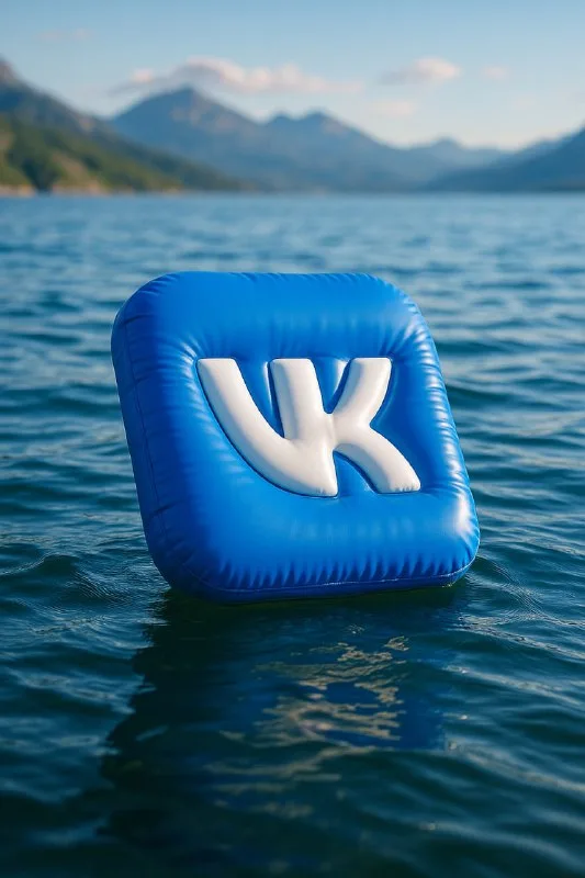
First compare two versions using the same logo at the same size. Then choose the setting. Comparing a large mark on the sea with a small mark on a lake changes both the story and scale, making the conclusion about the background unreliable.
Check the water and reflections
The mattress should touch the water rather than hover above it. Examine the contact line, waves near the edges and reflection below the object. A solid dark shadow unrelated to the ripples may make the mark look pasted onto a photograph.
The reflection need not be perfectly symmetrical: the water surface breaks it up. But its color and overall position should match the logo. If extra letters or a second version of the mark appear nearby, fix that area before assembling the layout.
Check brand colors separately. Light and water can affect their appearance, but the model should not randomly recolor a key part of the logo. For accurate advertising, compare the finished mark with the original file in your editor.
Where to place advertising text
Choose an area with fewer ripples and bright highlights. The headline should not cross the reflection, or words and object will compete for the same space. Add a small plain panel behind supporting copy if the water is too varied.
The logo already acts as a strong visual accent. A short message, deadline and one action are enough. For a separate lettering idea, see snow letters; for another branded scene, see an object inside a glass bauble.
Select the inscription for the next layout
The same approach works with a short name: create dimensional lettering and use it in an advertising image. Creative AI Typography offers material examples and ready-made text prompts; start with the free demo.