Select material for the banner task
New Year's visuals can be collected around one large element: the year, a short greeting, or the name of a promotion. Knitted numbers create a soft texture of yarn, while paper numbers create a neat composition of layers. For the first test, choose one material and a quiet background to check the shape of the numbers.
The original CreoPrompt publication used the year 2026. Below are preserved exactly those prompts with which the selection began. For a new banner, replace 2026 with 2027 before generation. The previews show the original work, not the promised result for another year.
Determine what else will be on the layout: product, congratulations, promotion start date or logo. If a lot of information is planned, numbers should not take up all the space. First, designate their place in the draft composition, then select the texture and light.
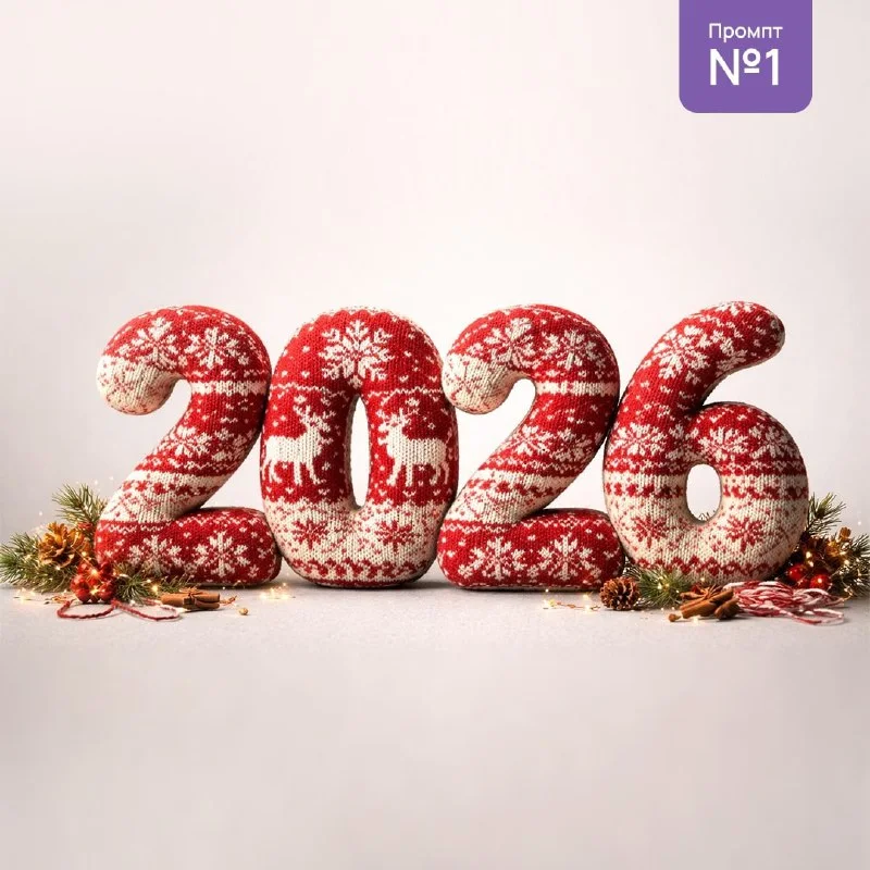
Knitted numbers from red and white yarn
New Year's numbers made of red and white yarn
Ultra-high-resolution New Year image of the number 2026, created as large three-dimensional knitted digits made from thick red and white wool yarn. Highly detailed fabric texture with visible stitches, soft fibers, realistic yarn tension. Scandinavian winter patterns woven into the knit, including snowflakes and reindeer motifs. Cozy festive atmosphere, soft warm studio lighting, subtle shadows, realistic depth and volume. Clean minimal light gray background. Photorealistic 3D render, extremely detailed, sharp focus, premium quality.Replace the year and, if necessary, the two primary colors. The request describes thick wool yarns, prominent loops and winter patterns. If the pattern makes the numbers too colorful, reduce it to one motif. First, the form of the number should be read, then the texture.
For a brand with a different palette, you can save the material, but choose your own shades. In this case, it is better to leave the light and background calm. If you change the pattern, color, background and angle at the same time, it will be more difficult to understand why the numbers are no longer readable.
If you need text instead of the year, replace the description of the number with a short inscription and remove the remaining links to digits. Simply substituting a long phrase for four digits may not be enough: the query will still describe the shape of the numeric element.
Numbers made from layers of paper
New Year's numbers made from layers of paper
Ultra-high-resolution image of the number 2026 created as intricate layered paper art. Multiple precisely cut paper layers forming the digits, with New Year motifs such as fir trees, stars and snowflakes integrated into the design. Visible paper fibers, clean edges, soft depth between layers, realistic shadows. Warm festive lighting creating a handcrafted premium look. Minimal clean light gray background. Extremely detailed, high-quality 3D paper-craft illustration, sharp focus.This option builds on cut paper layers, soft shadows and festive details. Replace 2026 with 2027 and check that there are clear gaps inside each symbol. Too many trees, stars and snowflakes can turn a number into a complex picture without a readable outline.
The paper effect is convenient for a more relaxed design. Try a limited palette and shallow layer depth. If the result looks plasticky, refine the matte surface and visible paper fibers while maintaining other conditions.
Assembling a festive composition
- Check the year by the numbers: the neural network can change one character even with the correct request.
- Remove the background if the numbers need to be transferred to another substrate. Adjust the mask around yarn or thin paper pieces.
- Place the main element on the banner and leave margins around it.
- Add the greeting, dates, and terms of the offer in separate text layers.
- Look at the layout on your phone and cut down on decor that gets in the way of the main message.
When advertising a product, use a relevant image of the product and do not cover up important packaging details. If the numbers already contain patterns, an additional garland around each element may be unnecessary. Start with a simple structure: year, product and one short title.
How to prepare multiple sizes
Keep numbers and text separate from the background. For a vertical story and a horizontal banner, you can rearrange the elements without stretching the finished image. Check for new indents and text wraps after each resize: automatically shrinking the entire layout often makes promotion terms unreadable.
In the working file, sign the year and design version. This will help you avoid publishing the old version with 2026 from the original selection. Before exporting, read all the text again, including small dates and signatures.
If you want a different material for winter advertising, compare these numbers with glass inscription or product in ice. Choose one leading effect to keep the banner cohesive.
Select the inscription for the next layout
For a holiday layout, you don’t have to limit yourself to two materials. In Creative Typography there are 823 prompts for decorative inscriptions with examples. Select an effect from the demo or full library.