Divide the greeting into a headline and a message
For a teaching example, take a short headline and a short two-sentence wish. Place the recipient's name and signature on separate lines. Do not send all the text to the generator: a long greeting is more difficult to check, and edits will require you to re-create the image.
First, sketch out the card in regular font. Determine where the heading is, how much space the wish takes up, and whether a separate image is needed. If there is a lot of text, choose a calmer composition. The postcard should allow you to read the wish, and not just look at the texture of the letters.
Get a short handwritten lettering
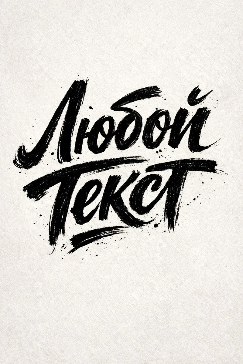
The request below is suitable for an expressive handwritten title. Replace the original text with your phrase. Start with one line and check for any stray words or extra strokes.
Expressive lettering with ink texture
Expressive hand lettering, "YOUR TEXT", emotional hand-drawn letterforms, bold organic strokes, visible hand movement, raw ink texture, artistic lettering style, neutral backdrop. 3:4Pay attention to word endings and letter combinations. The handwritten form can hide the missing character. If the title is read only after the hint, choose another option. Save the successful source and prepare it for placement: remove the background with a mask so as not to lose subtle strokes.
Choose a simple style for the greeting text
For body text, select a font with the language characters you want. It is not necessary to select a second handwriting typeface. A well-readable regular font will provide contrast to the accent heading. Compare a couple of variations on the same phrase, keeping the same size.
- Put a title and leave some white space around it.
- Place the wish as a separate block, and not close to decorative touches.
- Separate the name and signature with small spacing or a different style.
- Check line breaks: don't leave a random short word alone on a line.
If the name is longer than in the tutorial example, do not compress it horizontally. Change the block width or line break. For a series of personalized cards, test several names of different lengths in advance: the template should support real data, and not just the most convenient option.
Limit your decor to one theme
Choose one additional motif: a small floral element, a paper texture, or a simple accent color. He must support the congratulations. A few random objects around the edges often make the card look like it was put together from different sets. First, look at the version without any decoration at all.
Choose the color of the main text to contrast with the background. If the texture makes the line unevenly visible, weaken it behind the text or add a quiet area. Don't put a long wish on top of the most active details of the image. For a digital card, test reading on a small screen.
Check the name and finished file
Before exporting, check the greeting with the source text: salutation, punctuation and signature. Open the finished file again and make sure that no thin lines are missing. For printing, additionally coordinate the requirements with the printing house; Digital greeting card settings do not replace preparing a printed file.
Save the editable project with separate text layers. For the next congratulation, you can replace the name and wish without generating a new title. If you want a different material, look at letters from flowers, and for the edges of the image - preparation of transparent inscription.
Select the inscription for the next layout
In Creative typography there are other areas for headings: flowers, paper, fabric and volumetric materials. Choose for a specific congratulation, rather than adding everything to one layout.