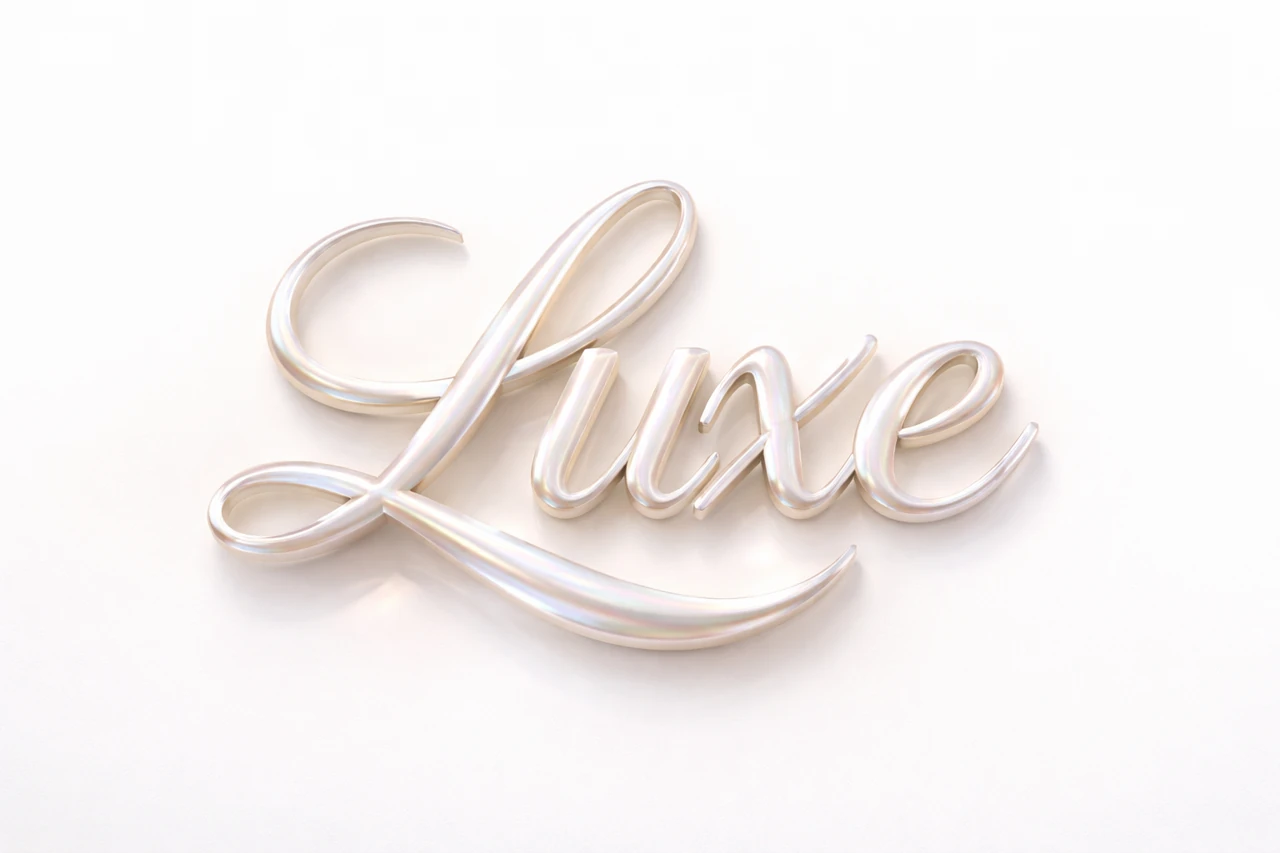
First collect one reference card
Let's introduce a series about three care products. The cards will have different short titles, but the title will play the same role. First, design one entire layout: background, photo, decorative inscription and explanation. Don't create dozens of headings at once without understanding how they will fit into the template.
The standard should work with both the shortest and longest word in the series. Write down the acceptable title area and minimum size for the explanatory text. If a long title does not fit, select two lines or a regular font in advance. Don't change the rules just for the last card when everything else is ready.
Capture the persistent part of the request
In the mother-of-pearl example, the material, palette and light set the stage. Copy the original request into a separate document. Mark the fragment with the name that will change. Leave the rest the same for the first comparative generations.
Mother-of-pearl inscription for beauty visuals
pearl luxe typography
"ВАШ ТЕКСТ",
pearlescent finish,
subtle iridescence,
luxury skincare aesthetic,
high-end beauty vibe,
hyperrealistic 3D,
soft studio lighting,
text only, isolated typography,
subtle shadow on white surface,
ultra detailed, 8k
In addition to text, save the selected format and available tool settings. Even with the same request, the result may differ; one prompt does not guarantee exact repeatability. If the service can work with a reference, use the approved image as a guide and check new options next to it.
Compare labels before assembling the entire series
Place the resulting options on one sheet of paper at the same scale. Look at the thickness of the letters, depth, viewing angle, direction of light and shade. An image may be beautiful on its own, but it may not match its neighbors. Choose by proximity to the standard, and not by the maximum number of spectacular details.
- Check the accuracy of each name.
- Select options with a similar shape and angle.
- Match the visual height of the headings in the editor.
- Check to see if one background or highlight is more different than the others.
- Collect a general contact sheet and evaluate the series as a whole.
A long word may be wider than a short one - this is normal. Don't stretch the short text to the same width. Keep the overall scale of the letters and enough space around. If you have to significantly deform the image, it is better to choose a new generation or a different line layout.
Carry that consistency into the layout
Record the margins, the location of the photo, the position of the explanation, and the style of the action. The accent color can vary by product category if this is a pre-selected rule. But you shouldn’t change the background, font, location and material of the letters at the same time: the series will no longer be perceived as common.
Create separate layers for the title, photo, and text. Name them clearly and keep the original generations nearby. When you need a new card, you can change the content step by step and compare it with the standard. It is also useful to store the option without decorative inscription for long or informational messages.
Check the series in the feed
Look at the cards with small adjacent previews. The overall style should be noticeable, and the different names should be distinguishable. If all the options look like the same splash of color, reinforce the semantic differences through photography and plain text. For the template itself, , a grid of posts for social media , will be useful, and for choosing a font, , a combination with a 3D header, .
Select the inscription for the next layout
In Creative Typography, it is convenient to choose the initial direction based on examples. For a series, save a successful prompt along with a working layout to repeat the material in a meaningful way.