Choose a short summer headline
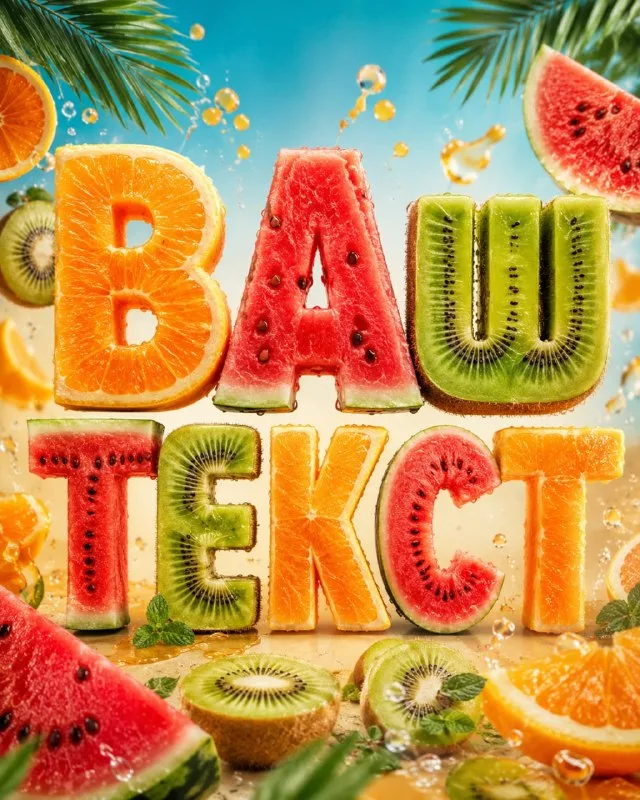
Post No. 425 contains a tropical fruit typography prompt. It specifies orange, kiwi, watermelon, bright sunlight and summer advertising styling. This is more concrete than a general request for juicy lettering.
Use “Лето” for the exercise. Four wide letters provide room to see flesh, seeds and peel. A long phrase creates more opportunities for texture to replace the character shape.
Decide whether each letter gets its own fruit or the materials are mixed. The source does not fix their distribution, so it may change between results. Specify it for a series of cards.
The fruit-lettering prompt
Letters with fruit textures
tropical fruit typography "TEXT", letters made of orange, kiwi and watermelon textures, juicy summer aesthetic, fresh fruit slices, vibrant tropical colors, bright sunlight, refreshing juicy details, playful organic typography, summer advertising style, clean colorful background, ultra detailed, 4:5 composition, 8kReplace TEXT with your wording. 4:5 describes the composition; also check the generator's format setting. The finished image should fit its intended placement.
Control three distinct surfaces
Orange has segments and porous peel. Kiwi has green flesh, a light center and seeds. Watermelon has a red middle and contrasting rind. You need not show every feature on every letter.
If the surfaces merge into an abstract colorful texture, make one material dominant. Watermelon could form a wide stroke while orange slices stay around it. Keep that choice across versions to compare shapes.
Check interior openings and crossbars. A watermelon seed within a thin stroke can resemble a hole, and an orange segment can resemble an extra character. Wide simple shapes are easier than complex script for this reason.
Separate lettering from a fruit still life
Fresh fruit slices and juicy details may add many pieces around the text. If the word stops being the main object, request fewer additional slices and clear space beside it.
Sunlight reveals the flesh's translucency, but overexposed white areas can erase the outline. Check the brightest parts: both edge and material should remain visible.
Bright backgrounds also need control. Kiwi may disappear against green; watermelon against red. Try a calm light background first, then choose color to suit the finished form.
Assemble a summer offer
Add a short subheading, price or date in your editor. Do not generate them with fruit letters: small numbers should remain accurate and editable.
View the banner at phone-card size. Appetizing texture matters, but so does reading the headline. If the background and slices stand out more than the word, remove decoration or enlarge the lettering.
For calmer natural styling, compare it with stone and moss. For a pale seasonal accent, use sand lettering: it has fewer colors and relies on its granular shape.
Select the inscription for the next layout
Creative AI Typography includes other material combinations and seasonal effects. Use the free demo to try ready-made prompts with your own short text.